


Well, I want to create some number posters to display in my classroom that matches the alphabet set. So I'm putting together these cute, colourful apple posters.

Here's a close up of some of the numbers. They aren't full page. They measure 6x8.25" to match my alphabet.
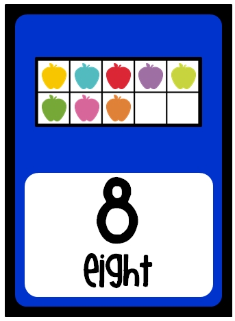


Now here's my dilemma.... There are ten different coloured apples. But notice how the coloured apples follow the same pattern on each number poster? Should I keep it like that or should I mix up the order of colours on each number? I'm not sure what would look best! Advice? :D
Oh, and I'll put these up as a Facebook fan freebie when I'm done!
I like that they're in the same order! Also helps the kiddos identify smaller numbers within! Super cute!
ReplyDeleteI also like the colors staying in the same order. I have that same alphabet set, so I'm very excited about these number posters!!!
ReplyDeleteSynonymRolls&AntonymMoments
I love these! I was going to attempt to make some number posters with ten frames but you have done it already! I was going to say in different colors but either wha is cute.,
ReplyDeleteThose are VERY cute!
ReplyDeleteJust a thought, but what about having each row of five the same colour to help kids readily see two groups of five in ten?
Take care!
Grade ONEderful
Ruby Slippers Blog Designs
I really like Barbara's idea of having each row of five the same color to help the kids decompose the number and easily see the group of five. May I also suggest keeping the colors a consistent pattern, random color patterns can be distracting. I would even suggest keeping the first five the same color, for example red, and then always having the second color the same color, for example blue. This helps kids to visually identify the rows, especially since if you put it up on the wall, it may be hard for some kiddos to see the rows from far away. Whatever you choose it will be awesome! I love you work! Can't wait to see the finished the product!
ReplyDeleteI like what Jillian suggested. Always using the same colors for each row (i.e. red is always the first row and so on) will help the kiddos see the progression and how each number grows. :) Hope this helps and I can't wait to see the finished product!
ReplyDeleteShibahn
Mrs. Landry's Land of Learning
Re: the quick stick alphabet and mounting on cardstock and laminating - I wondered if the laminating would make a mess (melt) the plastic quick stick pieces, as I have found other items that I liked but did not purchase due to the fact they were made from this product. Any tips or tricks for doing this? Thanks for much for sharing!
ReplyDelete